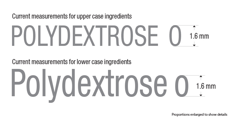
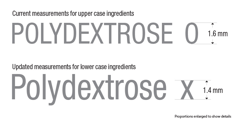
On an average sized product, the minimum font size for ingredients should be set at 1.6mm based on a lower case “o” or an upper case “O”. This means your ingredient list will take less room if you choose to use upper case letters (capitals) — When given the choice, designers will usually select the option that will make the design look less crowded; This is the reason ingredient lists are usually capitalized.
With the new regulations, your ingredient list has to be typed out in lowercase with Capital letters at the beginning of each ingredients. Sub ingredients contained within brackets do not require capitalization.
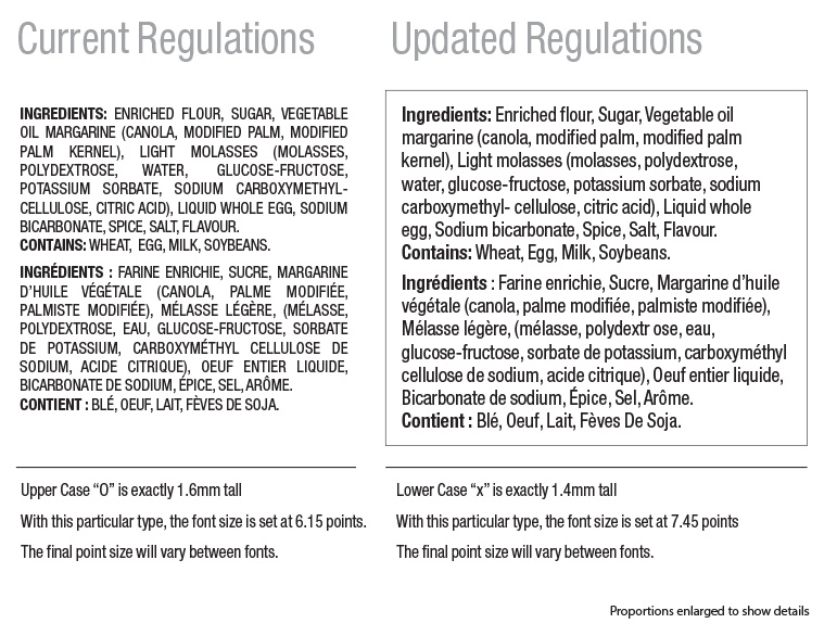
The updated font size takes a bit more room, but is much easier to read. The capitalized ingredients also helps separating them within the list. Here is a detailed image comparing the proportions between our current and updated regulations.
You can read this post Canadian Ingredients – Layout and Background Options to learn a bit more about background information.
Disclaimer: Packaging layout and information should be reviewed by an expert to ensure all regulations are taken into account. Certain rules apply to specific products and some of the rules are based on the size of your printable area or principal display panel (PDP).